
Guide: a website for a café or restaurant
- legal obligations
- the menu
- photography
- bookings and delivery
- reviews
What French law requires you to display, why your menu should not be a PDF, what the platforms take, and what bookings really cost.
What you get
Website or Google listing; the legal obligations; the menu; photography; templates with examples; hours and directions; bookings and their price; delivery and commissions; reviews; languages; what AI genuinely helps with; the pre-launch checklist
A café website does one job: get a hungry person with a phone to your table within a minute. Everything else comes after. But hospitality in France has its own layer of legal obligations, its own commission rates and its own price for getting the photography wrong — and that is exactly what ordinary website advice leaves out.
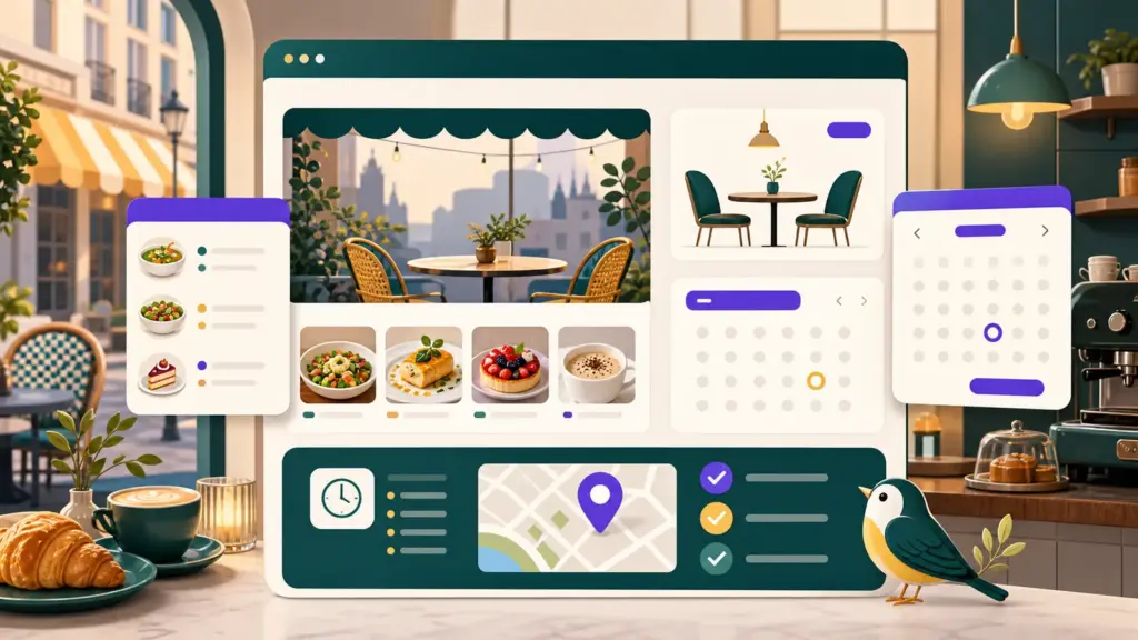
The guest decides in a minute, on a phone
The sequence is nearly always the same. Someone searches “restaurant près de moi” or opens Maps, sees a listing, looks at the photos, hunts for the menu and prices, checks the hours, and taps “directions” or “call”. About a minute passes between the search and the decision.
Which leads to something uncomfortable: your website is not first in that chain. The Google listing is, and it usually decides whether the person comes at all. The site takes over when the guest needs what the listing does not hold: the full menu you update yourself, bookings with no commission, the story of the place, job openings, takeaway.
Test it right now: open your own place in search on your phone and time how long it takes you to find the price of a main course and Sunday’s opening hours. Longer than a minute and the guest has already gone next door.
Website or Google listing: where to start
If hands and money are short, start with the listing, not the site. It is free, it appears on Maps and in answers to “near me” searches, and for a small place it brings enquiries faster than any website. How to create it and what to fill in: in the dedicated guide.
A website becomes necessary once one of four things appears. The menu changes often and you do not want to depend on whoever uploads it. You need bookings you do not pay a fee for per guest. You need takeaway on your own terms. Or the business has outgrown a single listing: private events, hiring, history, a second site.
The right order is this: the listing first, then one page of website, and only then everything else. The reverse order is the most common waste of money in this trade.
What the law requires you to display — and what of it belongs on the site
This is where hospitality in France differs from any other business, and not knowing it costs money. Checked in August 2026; the rules change, so cross-check with the DGCCRF.
Prices. This is not a conversion question but an obligation, set by the order of 27 March 1987. Menus and price lists must be displayed outside throughout service — no later than 11:30 for lunch and 18:00 for dinner — with identical documents available inside. Prices in euros including all taxes, and outside the characters must be at least 1.5 cm tall. A restaurant additionally displays the prices of at least five wines. Failing to display is a fifth-class offence: €1,500, and €3,000 on a repeat.
On wording. The law requires the words “Prix service compris” with the rate where you actually charge a service percentage. The familiar “prix nets” does not appear in the order at all — it is the customary equivalent for when staff are on a fixed wage and no percentage is charged. Using both at once is not allowed.
Allergens. The European INCO regulation and decree no. 2015-447, in force since 1 July 2015. The guest must receive information about the fourteen major allergens in writing: either next to the dishes themselves or — and this is lawful — through a visible notice saying where to consult the folder or sheet holding it. The key point: that document must be available immediately and without asking a member of staff. A waiter’s spoken answer does not satisfy the requirement. The fine reaches €3,750 for an individual.
Meat origin. Mandatory for beef since 2002. Decree no. 2022-65 extended it to pork, lamb and poultry, but it has expired; the text in force is decree no. 2025-141 of 13 February 2025, applicable from 19 February 2025 and with no end date. Citing 2022-65 means citing an expired text. The format is “Origine: country” where birth, rearing and slaughter happened in one country, otherwise “Elevé: … et abattu: …”. The medium is not prescribed: a notice, the price list, the menu, or any other support.
“Fait maison”. The mention (decree no. 2014-797) belongs only to dishes made on the premises from unprocessed products, with a short list of exceptions such as bread and puff pastry. The logo itself is optional — words are enough. And here the law names your website directly: article D122-3 of the consumer code requires the mention to appear on the supports used to present the dish “and on the professional’s other commercial supports, notably online”. In other words: if a dish is marked fait maison in the dining room, the same mark must be in the menu on your site. A false mention is a misleading commercial practice: up to two years and €300,000.
While we are here, two pieces of outdated advice still circulating in templates. The notice “Les plats fait maison sont élaborés sur place…” is no longer compulsory — the requirement was removed by the decree of 6 May 2015. And the link to the European online dispute resolution platform (ODR) must come off your site: the platform closed on 20 July 2025 and the link leads nowhere. It nonetheless sits in almost every ready-made set of legal pages.
What of all this has to be on the site. Prices, allergens and meat origin: no — those obligations attach to the premises and its price list. With two exceptions. If you take orders online, your online menu is the list people choose from, and then allergens and the final price must be visible before the order is placed. And the “fait maison” mention, as above, must appear online.
What must always be there, on the other hand: mentions légales (since the SREN law of 21 May 2024 that is article 1-1 of the LCEN, not “article 6” as the old templates say) and the consumer mediator’s details — article R616-1 requires the name, address and website of the mediator to be shown on your own site, visibly and legibly. For a restaurant this is compulsory even if you sell nothing online. What mentions légales must contain is set out in the website guide.
And on accessibility, where the confusion runs deepest. As an establishment open to the public you must keep a registre public d’accessibilité, but you are not obliged to publish it online: putting it on a website is an alternative to the folder on the premises, not an addition to it. Accessibility requirements for the site itself (RGAA) apply to companies above €250 million in turnover. The European accessibility rules that took effect on 28 June 2025 cover online commerce, but micro-enterprises — under 10 staff and under €2 million — are excluded. If you have outgrown those thresholds and sell online, that is a question for a lawyer.
The menu on your site: why not a PDF, and how to build it
A PDF menu is the commonest mistake on café websites, and it costs guests every day.
Here is what happens when a guest taps a PDF on a phone: the file opens in a separate app, the letters are a quarter of a matchstick tall, and they have to pinch and drag around the page. Half of them close it before reaching the mains. On top of that a PDF is nearly impossible to show properly in search, weighs a lot, and gets updated by a designer rather than by you.
The right answer is an ordinary page: sections, dish names, short descriptions, prices as text. A menu like that reads on any screen, turns up in search by the name of a dish, and takes you five minutes to correct.
The real question is not layout but who is going to change the menu every week. If the answer is “the contractor”, the menu will be out of date within a month and become worse than none at all: a guest arrives for a dish that no longer exists. So build the menu so that anyone on the floor can fix a price from their phone.
A practical compromise: the menu page on the site, plus a printable PDF on a separate link if you genuinely need one.
Photography: what to shoot yourself and when to hire someone
For a café, photography is not decoration — it is the product. Guests choose by the picture, and a bad photo of good cooking does more harm than no photo at all.
What a phone handles well: the room by a window in daylight, the counter display, coffee, pastries, work in the kitchen, your team. The rules are simple — daylight from the side, no flash, shoot from directly above or at forty-five degrees, clear the background. Twenty honest phone shots beat five stock images.
What a phone will not rescue: the room in the evening under warm artificial light, dark fine-dining plating, dishes with complex texture. If you are an evening restaurant, a photographer is not a luxury but a line in the website budget: without one, an expensive template will look empty.
What Google requires of listing photos: JPG or PNG, from 10 KB to 5 MB, recommended size 720 × 720 pixels. The photos must be your own — stock, collages and generated images are explicitly prohibited, and AI-made imagery is now named separately. Editing is allowed to be minimal: rotation and lighting correction; heavy filters are not. And an important one: a photo removed for poor quality cannot be appealed.
How many you need: Google recommends at least three in each of four categories — food and drink, the interior, the exterior from the directions people approach from, and the team. Twelve shots, and one day is enough for that.
Two technical rules that save you guests. Frame loosely: the Google listing wants roughly a square, social feeds want vertical. One shot does not fit every place, and a tight frame gets cropped at the edges. And compress: a phone photo weighs several megabytes, and a dozen of them turn the site into a slideshow on mobile data. WebP takes roughly a quarter to a third off a JPEG at the same quality.
One detail that trips up even contractors: the main photo on the first screen must not be set to lazy loading. That photo is usually the very element Google measures the page speed by — deferring it degrades exactly the number you were trying to improve.
Appearance: the template as a solution, not decoration
For a café, appearance is part of the argument. If the site looks cheap, the place looks cheap in the reader’s head. This is the case where buying a ready-made template pays for itself immediately.
Below are four WordPress templates from ThemeForest, for different kinds of establishment. Prices as of August 2026, one-off licence, with the marketplace fee and VAT on top. Do not judge by the cover — open the live demo, and open it on a phone: that is where you will be read.
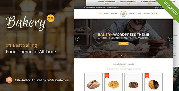
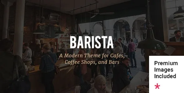
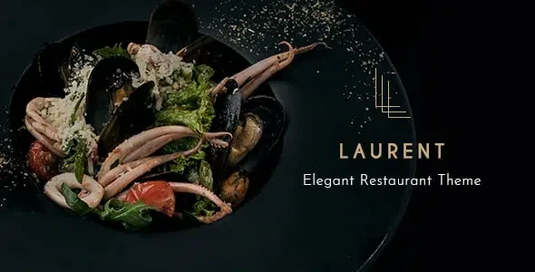
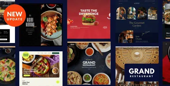
And now what the template listing does not tell you. Demo photographs are generally not included in the licence. That handsome plate of pasta on the cover belongs to a stock library, and after installation there will be a grey rectangle in its place. The line saying whether images are included is on the template’s page — read it before buying.
Hence the arithmetic: a €60–80 template without your own photographs does not work, and you should budget as much again, or more, for the shoot. And second: the demo installs in one click and takes a week to clear out — somebody else’s dishes, prices and addresses, plus a dozen pages you do not need, all have to be removed by hand. How a theme differs from a set of sections, and what everything else costs, is covered in the guide to a micro-entrepreneur’s website.
Hours, address, directions
The most galling way to lose a guest is wrong opening hours. The person is already at your door.
Hours must agree in three places: the site, the Google listing and the door itself. Google reads a mismatch between site and listing as unreliable data and shows you less. Set special hours separately: 1 January, Easter Monday, 1 May, 8 May, Ascension, Whit Monday, 14 July, 15 August, 1 and 11 November, 25 December — and the August closure if you close.
Make the address a link that opens directions rather than plain text: someone on a phone wants one tap. An embedded map is not necessary: it drags in third-party scripts and the requirement to collect cookie consent — see the website guide. A link to Maps does the same job and brings nothing along with it.
And state what people ask about most: terrace, step-free access, parking, whether dogs are welcome, whether there is a high chair.
Bookings: do you need a module, and what does it cost
First the honest question: do you need bookings at all? A café, a bakery or anywhere with fast turnover does not, and going without saves both the subscription and the weekly upkeep.
If you do need them, there are three routes. Phone and messaging — free, it works, but it ties up someone on the floor. Your own site: a form or a simple module — you pay for the tool, not for each guest. A platform such as TheFork: it brings new people, and charges for each one who turns up.
Orders of magnitude, August 2026: TheFork no longer publishes a single rate card, but industry estimates put it at roughly €2.60 excluding tax per cover seated (a range of about €1–5 depending on average spend), plus a subscription of €30 to €139 a month. Run the numbers on your own figures: eight hundred covers a month coming through the platform is already a serious slice of the annual take.
A sensible arrangement for most: your own booking on the site as the main channel, the platform as an acquisition channel — and you always know what each new guest cost you.
Delivery and the platforms: do the sums before you sign
The platforms bring volume and take the couriers off your hands. The price of that is a share that surprises anyone who did not work it out in advance. Figures as of August 2026.
Uber Eats: about 30% excluding tax when the platform delivers; about 15% if you deliver yourself; there is a reduced-visibility tier at around 6%. Deliveroo officially quotes a 14–30% range, but with fees and shared promotions an ordinary restaurant ends up near a third of its platform turnover.
In practice: at a third in commission, a €15 dish leaves you about €10, out of which you still have to pay for ingredients and labour. Delivery through a platform is not extra profit — it is a different and much less profitable business.
The sensible approach: the platform as a shop window for new people, with regulars moved onto your own channel — orders through the site or by phone, with a small advantage for ordering directly. Your own channel starts paying for itself sooner than you would think: start from what you hand the platform each month.
Click and collect: who actually needs it
Click and collect means ordering and paying online, then collecting in person. No couriers, so no delivery commission.
Who it suits: bakeries, patisseries, cafés, anywhere doing lunches to take away — anything picked up on the way and bought repeatedly. Who does not need it: a restaurant with table service and an evening trade; there it is a feature nobody will use.
Costs: on the platforms, click and collect is cheaper than delivery but not free — around 12–15% at Uber Eats and 14–18% at Deliveroo. Your own module costs a fixed sum per month regardless of turnover. The break-even takes five minutes to find: multiply your monthly takeaway turnover by the platform’s percentage and compare it with the subscription.
And soberly about launching: taking payment online is a separate setup with separate obligations, terms of sale and refunds included. Do not start there in week one.
Reviews: Google or TripAdvisor
In France, for an everyday establishment Google matters more: that is where people search “near me”, and that is where the main flow comes from. TripAdvisor keeps its weight in tourist areas and for places aiming at visitors; if you are in the centre of a holiday town, you need it.
The general mechanics — how to ask for reviews without getting them deleted, and how to answer bad ones — are covered in the Google Business Profile guide, including the ban on asking only satisfied customers and the French liability for false reviews. We will not repeat it.
What is specific to hospitality. Reviews arrive in waves after the weekend, so it is better to answer on Monday, in one go. Complaints split into two families, the food and the wait — the second is fixed by the rota, not by a reply. And there is almost always one review about something you do not serve at all: the person has confused you with somewhere else. That is the case where reporting it is worth the effort, and it usually succeeds.
Keep your review link short and print it on the receipt or on a card by the till — asking everyone alike is simplest that way.
Languages: what to translate and what to leave
Translating the whole site into a second language makes no sense for a small place — it is work you then have to maintain in two versions.
What you need is the minimum for someone who does not read French: the menu and the essentials — hours, address, how to book. That is enough for a decision.
English is justified almost anywhere visitors pass through. The second language is chosen on the strength of your actual guests, not a hunch: look in the listing statistics at where people are searching from.
And an honest caveat: machines translate dish names badly. “Magret”, “rôti”, “confit”, “gratin” turn into nonsense or into a different dish altogether. A translated menu should be read over by someone who knows both the kitchen and the language — otherwise it comes out funny, and sometimes not funny at all.
What AI genuinely helps with, and where it does harm
For a café, AI is more useful than in most other trades — but exactly where the cost of an error is zero.
Where it helps. Dish descriptions: you dictate the ingredients and the method, it turns them into two live lines instead of “delicious chicken dish”. A first draft of translating the menu and the site. Options for answering reviews when you cannot bring yourself to write calmly. Text about the place, its history, the team. Ideas for posts and seasonal offers a month ahead. And proofreading French, if it is not your first language — it is particularly good at that.
Where it does not help. It knows neither your dishes, nor your prices, nor your suppliers, nor your town — and instead of saying “I don’t know”, it invents. Anything touching the facts of your business is written by you; it only rearranges the words. And a menu written entirely by a machine reads like a chain’s menu, not like yours.
Where it does outright harm. Allergens and ingredients: never. That is a guest’s health and your liability, and the information comes from the recipe and the supplier. The same goes for meat origin and the “fait maison” mention — those are claims you answer for. Generated photographs of food: those are not your dishes, so the guest sees one thing and receives another. And identical automated replies under every review are spotted at a glance.
The rule is simple: AI can be trusted with form, never with facts. The moment a text contains a number, an ingredient or a promise, you check it yourself. On the tools that assemble a whole site and where they bite, see the no-code guide.
What to check before launch
Go through this list on a phone rather than a laptop — and ask someone who has never been to your place to go through it too.
The menu decides, not the design
A menu as text on a page, with prices and allergens, that you can correct yourself in five minutes. A PDF does not read on a phone, and an out-of-date menu is worse than no menu at all.
Work out the commission before you sign
A delivery platform takes around a third of turnover; a booking platform charges for every cover seated. That is not extra profit, it is a different economy.
Your own photographs, or none
Stock food is spotted instantly and works against you. Twenty honest phone shots in daylight beat five bought ones.
Another common mistake: the prices on the site have drifted from the prices in the room. Guests notice and read it as dishonesty, and in an inspection it is you who explains the gap between the price list and the price charged. When you change prices, change them the same day in all three places: the room, the site, the Google listing.
- The price of a main course and the hours are found in a minute on a phone
- The menu is text on the site, with prices, and matches the one in the room
- Allergens are available in writing — on the menu or on request
- Meat origin and “fait maison” appear wherever they are claimed
- Hours match on the site, the Google listing and the door
- Holiday and closure hours are set in advance
- The address is a link to directions, not plain text
- The photographs are your own, some are vertical, the files are compressed
Webinkub does not replace legal, tax or immigration advice. When a question goes beyond the digital side, I say so and point you to an official source or a specialist.
Get in touch
Write to Webinkub
Send the link to your site or your profile — I’ll tell you what stops a client from reaching the table.
You might also like
Guide: a foreign entrepreneur in France
How to explain your service, your region and your working languages, and how to dispel doubt while you are settling into France.
Guide: a website for a beauty salon
Services, prices, photos of your work and booking in one step: what decides it for the client and what drives local visibility.
Guide: How to Register a Micro-Entreprise via INPI
How to set up a micro-entreprise via INPI (guichet unique): required documents, the five steps of the form, SIRET timelines, and common reasons for rejection.